El caché NO está en las coordenadas publicadas.
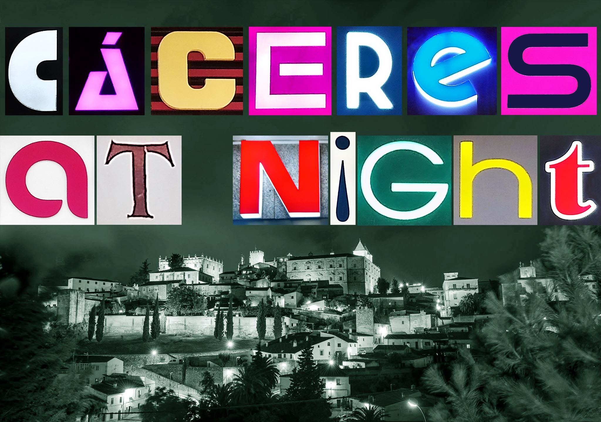
Las LETRAS se inventaron para ser leídas, pero también pueden ser uno de los objetos visuales más bellos inventados por el ser humano. La elección de una fuente tipográfica es uno de los grandes desafíos del diseño. Elegir la letra más idónea, legible, de calidad y que respete el espíritu y carácter del tema que queremos comunicar es tarea del diseñador gráfico, que debe analizar el mensaje y seleccionar una forma visual determinada que lo potencie. Así nace la tipografía creativa, el arte de comunicar mediante signos impresos.
En las CIUDADES las letras están por todas partes, un ejército que nos rodea siempre dispuesto a reclamar nuestra atención. Hoy jugaremos a mirarlas con ojos escrutadores y curiosos, a fijarnos en detalles, proporciones, matices o colores que antes nos habían pasado desapercibidos. A mi me apasiona, a vosotros espero que os guste.
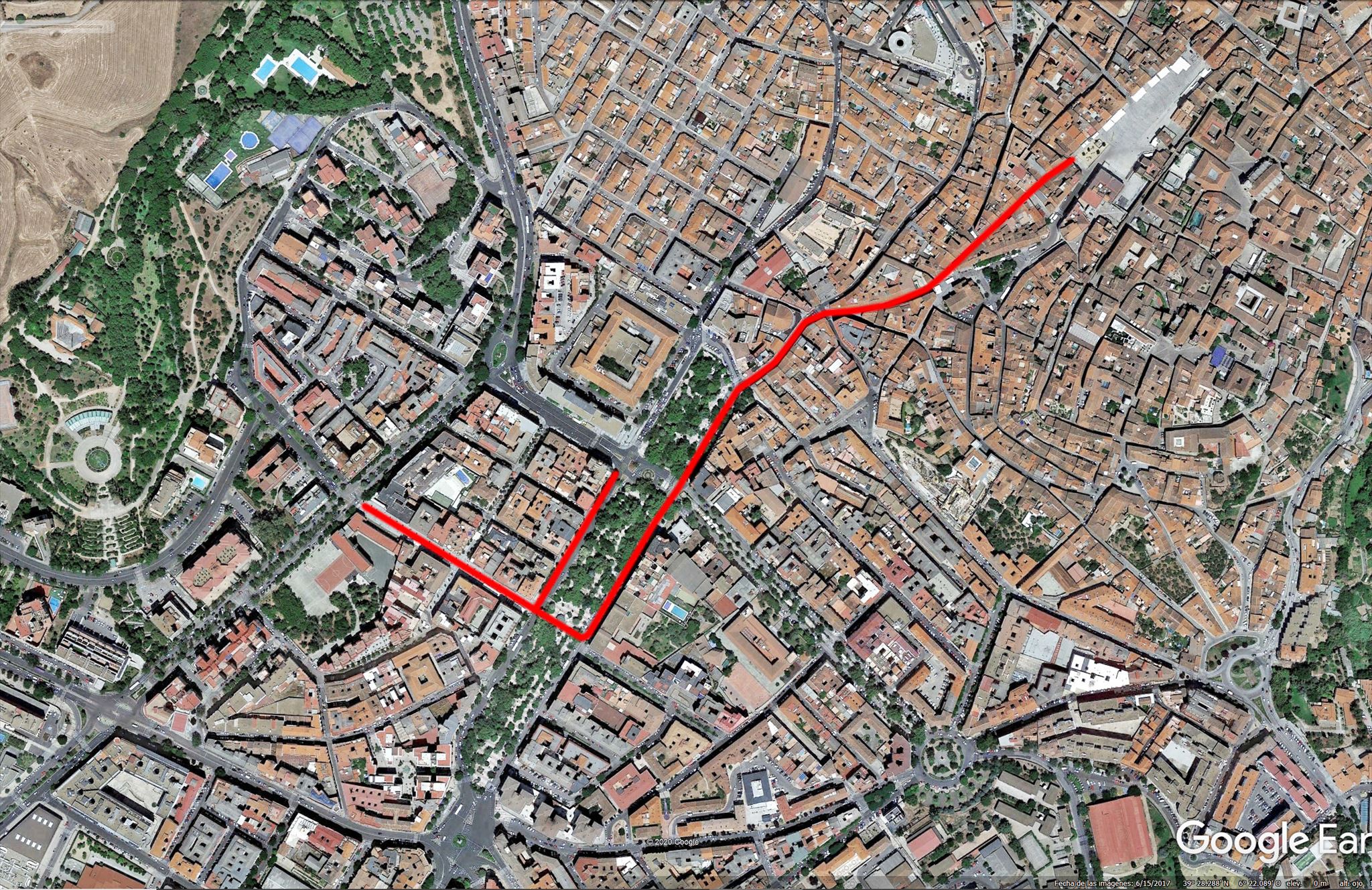
SOLUCIÓN. Se trata de dar un paseo por las calles marcadas en el PLANO que encontrarás más abajo buscando las palabras de donde se han tomado las letras para componer la frase que encabeza el listing. Todas están en la calle y no guardan ningún orden preestablecido. De estas palabras tomaremos la primera letra de cada una de ellas y con estas primeras letras compondremos una sola palabra, larga y sin sentido, de 14 letras.
Dicho de otra forma: partimos de CACERESATNIGHT donde debemos sustituir cada letra por la primera letra de las palabras de donde se han tomado las de nuestra composición. Esta palabra sin sentido (en mayúsculas y sin espacios) será la contraseña para obtener el OK del Certitude y las coordenadas finales del geocaché.
El juego se presta especialmente al trabajo en equipo. Mezclando casco histórico y ciudad moderna el recorrido nos llevará por las calles: Pintores, San Pedro, San Antón, Avenida de España y San Pedro de Alcántara
LETTERS were invented to be read, but they can also be one of the most beautiful visual objects invented by man. Choosing a typeface is one of the great design challenges. Choosing the most suitable, legible, quality letter that respects the spirit and character of the subject we want to communicate is the task of the graphic designer, who must analyze the message and select a specific visual form that enhances it. Thus was born creative typography, the art of communicating through printed signs.
In CITIES the letters are everywhere, an army that surrounds us always ready to demand our attention. Today we will play to look at them with scrutinizing and curious eyes, to fixate on details, proportions, shades or colors that had previously gone unnoticed. I am passionate about it, I hope you like it.
SOLUTION. It is about taking a walk through the streets marked on the MAP that you will find above, looking for the words from which the letters have been taken to compose the phrase that heads the listing. They are all on the street and do not keep any pre-established order. From these words we will take the first letter of each of them and with these first letters we will compose a single word, long and meaningless, of 14 letters.
In other words: we have CACERESATNIGHT where we must replace each letter with the first letter of the words from which those of our composition have been taken. This nonsense word (in capital letters and without spaces) will be the password to obtain the OK of the Certitude and the corresponding final coordinates of the geocache.
The game lends itself especially to teamworkMixing the old town and modern city, the tour will take us through the streets: Pintores, San Pedro, San Antón, Avenida de España and San Pedro de Alcántara

Puedes validar la solución a tu puzzle con certitude.