THE CACHE IS NOT AT THE ABOVE LISTED COORDINATES! YOU MUST SOLVE THE PUZZLE FIRST!
Back in the early days, fonts were made from cast metal used on printing presses. Each character had to be manually composed and lined up to create the words, sentences, and paragraphs for books and newspapers, a very labor intensive task. Johannes Gutenberg invented these type characters and the printing press in fifteenth-century Germany. The storage of metal printing types in two cases, one for big letters and one for small, created the terms “uppercase” and “lowercase” which is still in use today. With the introduction of computers and the electronic age, we now have thousands of different fonts to choose from, some easily downloaded free from the internet.
Some fonts have serifs which have little lines extending from the edges of the letters. These fonts tend to be easier to read in printed blocks like in newspapers and books. Times Roman is a classic example used in these cases. Sans serif fonts like Helvetica work well for small typefaces and web pages since the resolution of monitors can affect the clarity.
Deciding what fonts to use for your project can be a bit overwhelming which is why most just pick a font that is already on their computers. But there are some guidelines to follow that can help you make your project more professional looking. Comic Sans was a font meant to be used for speech bubbles on comics and for kids pieces. If you use this font on your business cards you are sending the wrong message. You want your fonts to convey the intent of your message which is why you won’t see strong bold upper case letters on a sympathy card. Some fonts may not read well in all uppercase letters like script and blackletter fonts. Also, make sure your font choice is readable at the size you are creating. We have all seen yard signs that can’t be read while driving by and the message is lost to the observer. All of these things need to be considered when designing your project.
To find the final location of this cache, you will need to identify some fonts first. Some fonts have multiple versions which may make this a bit tougher. Choose the right font based on a single number alone and you will have your final coordinates!
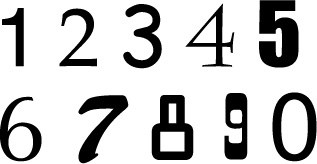
The cache is located at N44° AB.CDE W088° FG.HIJ
A = Helvetica
B = Brush
C = Charlemagne (+3)
D = Optima
E = OCR A (-6)
F = Palatino
G = Arial (+1)
H = Impact
I = High Noon
J = Comic Sans